I helped launch the new myHEB app
Design QA • UX risk management • Engineering-design mediation
Brought on as a contractor for 7 months, I worked on the product team responsible for the delivery of the newly redesigned myHEB app for iOS and Android - a fresh, on-brand experience introducing in-app curbside pickup and home delivery shopping options, not to mention a few other nifty features. Officially released December 2019, Texas' favorite grocery store chain made a huge statement with this app, clearly showing they are invested in improving the user experience of shopping their products - digitally and in-store - and are betting their chips and queso on shoppers' wanting new, more convenient ways to check off their shopping list - because its got those too!
The new way to shop at HEB
3 ways to shop: curbside, delivery, in-store.
Shop items from your phone and arrange to pickup curbside or home delivery. Or if you're old-fashioned, see what your local store has in stock and find its exact location. Any way you choose to shop, try out the incredibly useful shopping list feature!
Never miss out on savings.
Clip coupons in the app to apply automatically at mobile checkout or scan the barcode in your app to redeem all that apply. You'll even be reminded if you missed any chances for free items or savings at checkout!
Brings the aisle browsing experience to wherever you are
Find your favorite or nearest HEB store and see only products currently available, or browse a wider selection of items available for home delivery. See what's new or only available for a limited time in curated and seasonal collections.
What I did
and how I did it
My primary role on the team - our project's working title locally dubbed "P0" - was to ensure that the app looked and behaved as intended on all supported device platforms and sizes: that means validating every detail of every layout, component, and interaction on iOS... and Android - I did have a partner, thank the Texas grocery overlords! It's a role that put me in the unique position to observe the flow of work from design to development and witness the startling amount of risk that moves unchecked downstream in the form of visual bugs, missing or conflicting interaction behavior, and sometimes, portions of a design framework predicated on incompatible backend services and/or data models. It's the job of Design QA to manage that risk and do so in a way that balances achieving the original product design vision with stable, practical progress.
While much of the work could be accomplished following a straightforward process, a significant portion of unplanned work arose from "off-script" interaction behavior that could not be solved through frontend changes alone. Quite often, undesirable interaction behavior can be the result of attempting to override native UI patterns or calling on backend systems with mysterious business rules. In these instances, an understanding of how user input is handled by front and backend interstices is required in order to locate the human service owners with whom conversations must begin to determine whether it is a redesign or an engineering workaround that is due before launch. As I spent more time behind the scenes of app development, I grew more sympathetic to engineers' plight and receptive of their wisdom and insights when trying to balance stable progress over perfection.
The design QA process
Following a quick brief by the product team on their goals for the app and their workflows and methods, I generated a templated design QA process for the discovery and tracking of visual and interaction issues. As outlined below, design-build parity was driven through the continuous review of the latest build on an array of iOS and Android test devices; and where discrepancies and/or deficiencies occurred, a ticket was generated with evidence of the problem and requirements to resolve, followed by review. As mentioned above, the process wasn't always straightforward; and as I'll mention further down below, no business should really ever put itself in a position where they need design QA.
01 Check for page-level visual bugs
layout • type • color • component properties • labels • assets
02 Test interaction behavior and pathways
form validation • component states • screen transitions • UI logic
03 Break out bugs into as few tickets as logically possible
Tickets goes to backlog for sorting and prioritizing by pm
04 Document interaction behavior not found in original wireflows
Is this behavior undesirable? Does it stem from the front or backend? How might we solve for best UX?
05 Repeat all above steps across array of screen sizes and devices
Test for responsiveness and compatibility
Pain points of design QA
Design QA isn't a household phrase yet, and to be frank, I had not heard it before I was reached out to by H-E-B (by way of RevUnit), but I was thrilled by the chance to work on a product my family would use and felt lucky to see inside a company as beloved by its customers as H-E-B, so I accepted the offer. And there began my journey into researching and designing a new risk management layer into the workflow of Texas' favorite grocery chain's new flagship digital product. I've covered the goals of the work and how it proceeds in general terms above, but now I'd like to share with you some of the pain points I experienced - from a design research perspective - as well as some of the ways an organization makes it hard for design QA to happen - a.k.a things I would have done differently and/or addressed if I could do it all over again.
The work can be tedious.
The tediousness was due in part to the frequency of inconsistencies in instances of the same component, i.e. the positioning of global controls in the nav-bar, that led to my distrust and therefore commitment to be tedious as a person. The job itself is to review every detail to preserve the designs or evolve them either with or beyond the technology, so granted one would expect tediousness; but where we can do better and save time and human energy is if each time a developer decides to build a component that already exists and does it in a dramatically, wildly different way, they instead ask themselves "can I do this with less code, and where am I making assumptions about how this code will or should express itself?".
Things we fixed, reverted or broke in new ways.
You fixed it - great. Whoops, it broke again, and we don't know why. Fortunately the mobile frontend development team came up with a utility test when pushing code that would flag and attract attention to potential UI drift - let's call it "the drift test." The only problem with it, nobody wanted to use it because it added more work. And if there's one thing developers need less of, it's work! Whose responsibility is to catch drift? Well, mine actually; but where and how can we reduce that risk upstream?
Custom UI and interaction patterns are cool but native patterns are stable.
One of the pearls of wisdom I received while at H-E-B in my design QA capacity was that native patterns can't be beat when it comes to stability and reduced risk to your entire product turning into a freakin' nightmare. Swooped headers and animated grocery bags with real physics is cool and it.will.turn.heads, which is convenient when your product is headed off a cliff after the next iOS update.
Zeplin does not equal Abstract. Zeplin doesn't equal anything.
Zeplin falls out of sync with Abstract fast. And I'm not sure anyone made it a priority to make sure that didn't happen. How, if you ask yourself, in the hell are developers to know what to make if their references are old?! And really that's only the tip of the iceberg when it comes to how Zeplin failed engineers every day during my time at H-E-B. Annoyingly - and the Sketch company should really do something about this, or maybe not them, but somebody should - when you draw shapes in Sketch, the border is by default set to the center of the shape's bounds. But when you sync to Zeplin, the positioning it shows developers is from the outside of the border. Really defeats the purpose of being pixel perfect in the first place, doesn't it?
Is there a shortage of Android developers, or do designers only own iPhones?
With each code commit, the latest iOS build made steady progress on feature tickets, and I could count on the number of design QA tickets to steadily decline. The code was clean when I first arrived on the project and it stayed clean; I was even lucky enough to have a dedicated engineer for a few hours a couple of times a week to solve and review tickets. And better yet, we had regular iOS bug bashes, the buzz of which attracted other engineers and designers whose input and collaboration meant more stable solutions that did more than just spot-fix UI bugs: engineers learned from one another, and designers could help answer engineers' questions and make decisions on the minutiae of interaction details that engineers might have otherwise decided on for themselves by letting the native UI take over. Android was a different story. I don't know exactly why the Android progress was haltingly slow, besieged by visual and interaction bugs from the start but too far behind, even at my arrival, on feature ticket implementation to spare engineering resources; and in fact, months were spent on refactoring the frontend codebase following pressure to finally give the code a good cleaning, leaving the Android app looking like it got run through Google Translate - ticketing these issues ceased to make sense as they began to pile high and ceased to be relevant as the code continually changed and drifted like a plastic shopping bag in a parking lot. There are two key observations I made that might explain why we had such a situation on our hands: one, iOS team hiring far outpaced Android; and two, a majority of designers own iPhones. When you, as a designer, update to the latest build to check progress and can't believe your eyes, problems are more likely to get solved then and there, or plans to get them solved are made.
Not all the design work has been finished, or even dreamt up yet!
It's not a big leap of the imagination to see how development can begin before the final design has been stamped ready. And it was not uncommon for me and my design QA partner to unearth user scenarios that interaction designers might need to give a once-over to make sure they hadn't allowed any UX dead-ends or uneven-basement-stairs to remain. Not all of the user stories had been written up yet by stakeholders, and naturally more would come in following further production environment testing, and on the rare occasion some aspect of the original design trips over itself or can't be accommodated by a funky API endpoint, you're dealing with some form of refactoring and change to code. And that's all fine, even expected; but the real travesty to stable progress is content and interaction design with specific rules on its way down the pipeline - or still just a twinkle in a designer's eye - that will wreak havoc on the engineer unlucky enough to be assigned the impossible task of figuring out how they're supposed to make this work. And worst of all, indications of a bug or potential meltdown were present early on but were never addressed. Why are we three months from launch and have two endpoints that return different data models and no one knew about it until a new hire began coding the feature? Why can't all we just be a part of planning and make sure developers have what they need and know when to ask for what they don't?
Why your business can't afford design QA
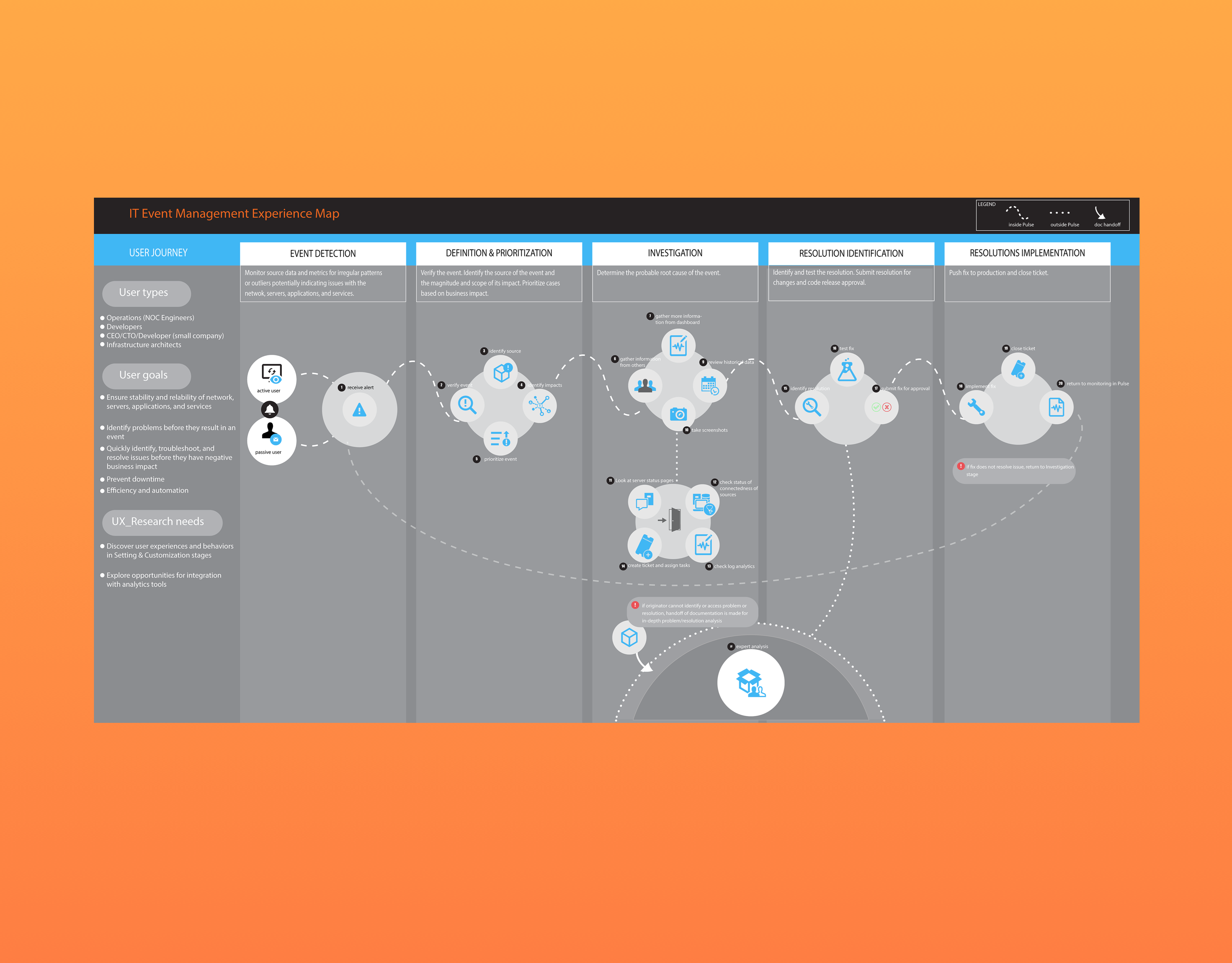
However an organization chooses to flatten their app's bugs, work around technology barriers, and deliver a 5-star product, I strongly believe that managing risk to your product's UX begins with cultivating a team culture that operates in a low-risk format and validates design work with the humans who own and are creating the services your product relies on before development begins. It reminds me of a project I worked on as a user researcher at an enterprise IT software company. The ask by the product team was simple: they wanted to know why no customer endusers were using the change management calendar feature in one of the company's powerhouse flagship IT management products. A few hours of user interviews, insight synthesis and experience mapping later, I'd found their answer: customers weren't using it because it sucked. And when things suck for a company's IT, it's not because it's just not useful for the money - they didn't pay for it, their boss did - it's because it adds chaos to the system, and that is the enemy of good IT. The calendar feature made it too easy to blindly schedule changes to the business' technology; in one interview I learned that someone had merely dragged their mouse over the tool and accidentally rescheduled a change that caused an IT incident. In all the interviews, the biggest problem I heard was that the business' technology and its people were hidden from one another and worked as if in the dark. Even if you used the calendar, you couldn't rely on it warning you or blocking you from making changes to technology that helps sell hotdogs to Texans right in the middle of grilling season. My point is, do what the organizations who overcame the limitations of their tools did, and have regular meetings with humans where they discuss their work and the goals they have for it; everyone will benefit from this, straight up to the business and straight down to the enduser. Don't crash the business or deliver buggy apps when it could have been prevented. Obviously. But less obvious are the risks you are allowing to make their unchecked downstream; and it's only added risk to let the responsibility of managing the vulnerabilities of your teams' operations and the structure of the larger workflow to rest on the shoulders of two designer-engineers. And can somebody please get those designers Google phones - this will not only light a fire under Android developers' feet to seek correct implementation, but it will also mean designers are exposed to just more than iOS inspiration which will in turn mean easier-to-implement by Android engineers. It's just a thought :)
Some artifacts of the design qa review process
The artboards posted below are only a few of the literal hundreds that I created and shared with developers during my time at H-E-B digital. They served as a means to illustrate where a problem resides, what the problem entails, and solutions requirements. I created these in Sketch, exported to InVision and shared via a link attached to design QA tickets, or in some cases, shared in the #designQA Slack channel to get answers and start conversations on how we might preserve UX goals while advancing and adapting product implementation. Looking back at these artifacts, I am astonished at the volume of documents I crafted - each essentially an instructive page to help engineers work through uncertainty and cover implementation gaps inherited from upstream.
And the rest...


