
A redesign of eBay native on Android
Problem Diagnosis • New Interaction Framework • Prototyping • User-Testing
I am an avid user of eBay. Whether actively shopping or passively browsing, the e-commerce app is a fantastic source of great finds at even better prices. However, the transition from desktop to native app has negatively impacted the user experience. I blame clunky navigation, insecure information architecture, a lack of empathy for user behavior, little user testing, and a wonky interaction framework.
Finding flaws
Navigation is redundant, indecisive and disorienting

The first view is a Home screen with three fixed tabs [Activity, Shop, Sell]. A persistent hamburger menu presents a list of expanded options all of which point to views accessible through the fixed tabs in the Home screen. These two top-level navigation patterns have a lot of overlap and do nothing more than confuse the user with redundancy and disorientating architecture.
Inefficient refine and sort menus
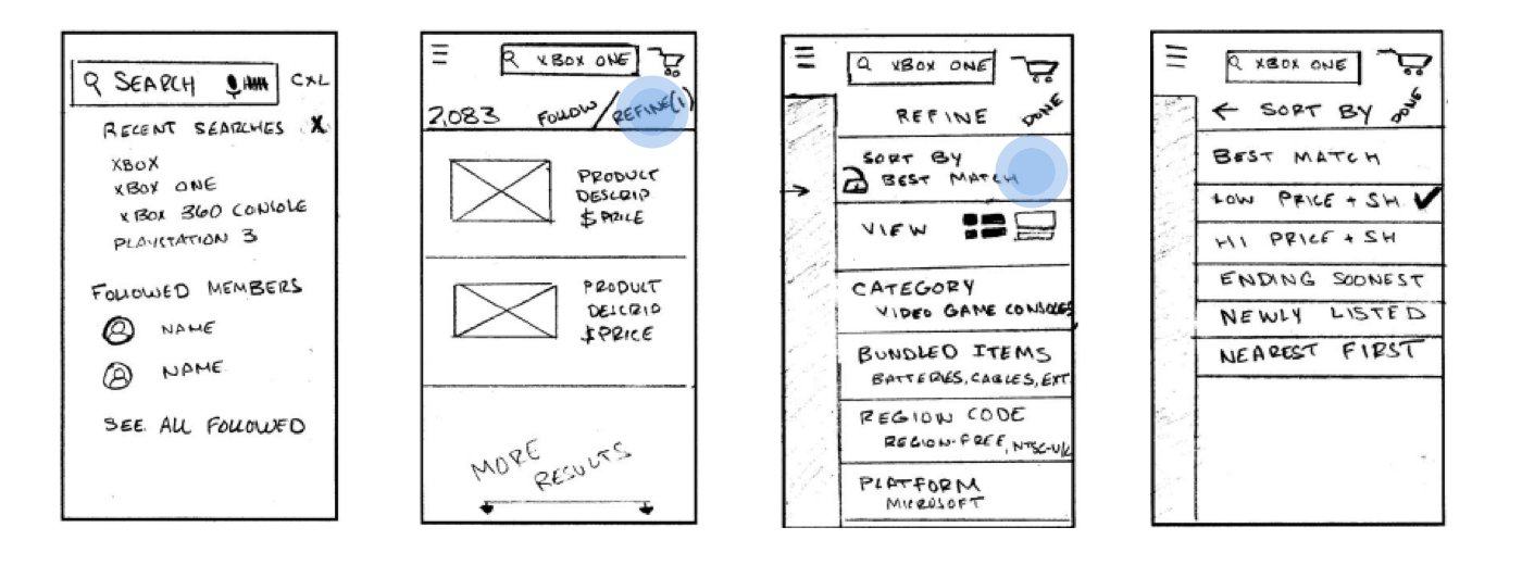
Search functions in previous versions of the native app were much improved. In this current incarnation, the user is unable to see which options are enabled, and the bundling of Sort and Refine as well as the lack of any meaningful hierarchy in the refine drawer menu make for a frustrating experience. Particularly the method of refining the "buying format" is incredibly inefficient: choosing the auction format requires scrolling down the drawer menu, selecting "buying format" in order to drill down to further options.
The bidding system makes losers of us all

Auctions are a time-sensitive and competitive game. This should imply incredibly accessible bid data and functions; however, the current native app places absolutely no precedence on on-going bid wars by effectively hiding information within submenus and requiring the user to drill down multiple levels before placing a new and higher bid.
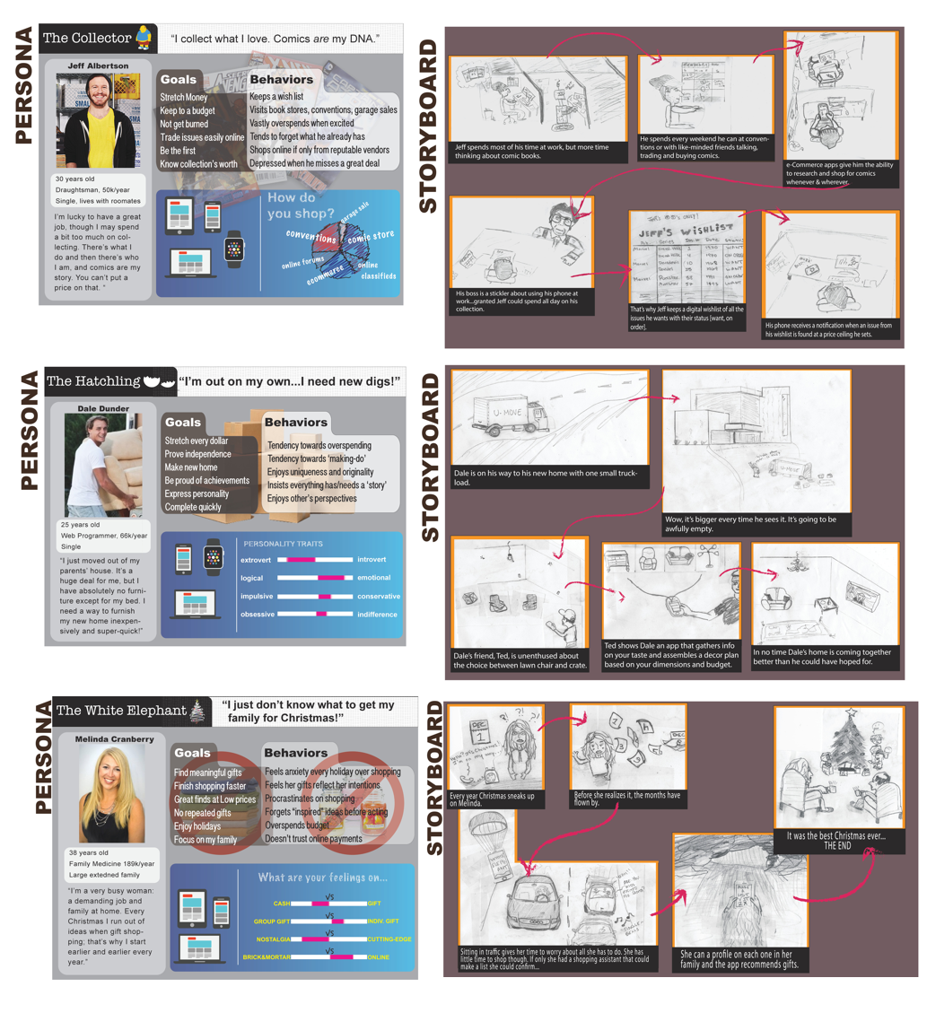
Understanding the user for their goals
I developed three different personas with three separate major goals, ran them through scenarios in the effort to guide the native eBay app to greener pastures.
A new interaction framework
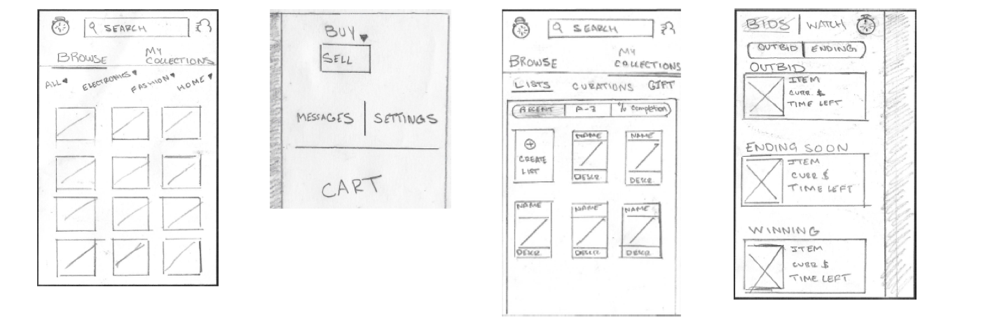
Removing the persistent hamburger menu eliminates the typical cons of such a UI element, specifically allowing the fixed tab menu to flourish as the primary top-level navigational structure. You may have noticed that "Sell" was removed form the tab menu - all sell functionality has been removed from what I conceive of as the buyer's task flow; thought it can be accessed from the right-hand profile menu by switching the user from "buy" to "sell" mode. The preeminent UI change occurred with the left-hand persistent drawer containing all time-sensitive data objects. Notifications on items in this drawer can be directly acted upon in a much quicker way than is currently allowed. I have also reinvented the eBay shopping experience outside of simple browsing by embracing a "collector's" attitude towards shopping. In essence, this app simplifies shopping to the point that you are presented with only the things you need at the price you can afford them, effectively removing the need for searching and browsing all together.
Wireframing the keypath scenarios
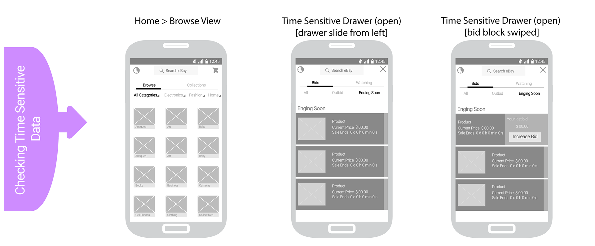
Checking time sensitive data is vastly improved with this interaction series. One of my biggest gripes with the current eBay app is the length of time it takes to get to your current bids, as well as the relative obscurity of affordance for exactly how to get to the information at all. Winning bids are often made with less than one second left! I need to be able to watch and place bids quickly and easily. Placing a lefthand drawer on screen means more wins!
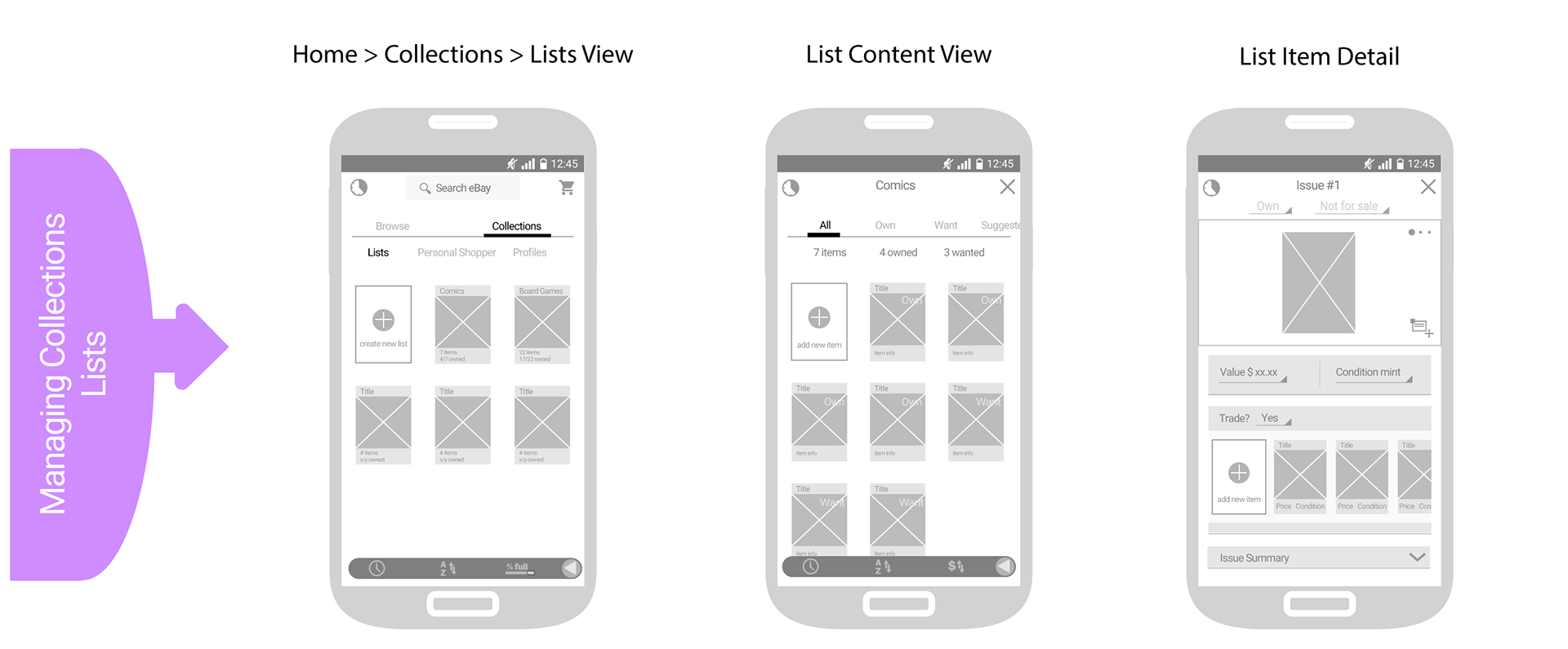
Collections play a big role on the desktop version of eBay; however, in app they are more relegated to browsing collections of items rather than curating your own collections. With the above scenario a user can generate a list of items that are of the same category: making note of items they have or items they want (for which notifications will be received when items become available). They can even list items for sale from here, or as is the case above they can list them for trade for something of their choosing.
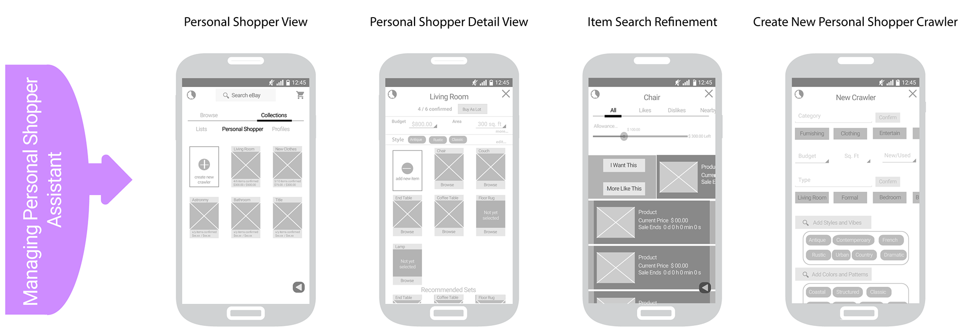
This scenario was the most conceptual and therefore most rewarding to research and materialize. Creating a personal shopping assistant is like telling a personal shopper your style and taste, budgets, and other constraints with complete trust that they will come back to you with a "lot" of items to be reviewed and purchased all together. The series of screens above satisfies the scenario in which a young man moving into his first new home needs furnishings that suit his budget and tastes; the catch is he has a busy new career leaving little time to shop. The personal shopping assistant crawls eBay for those items that fit his needs all with the least amount of effort.
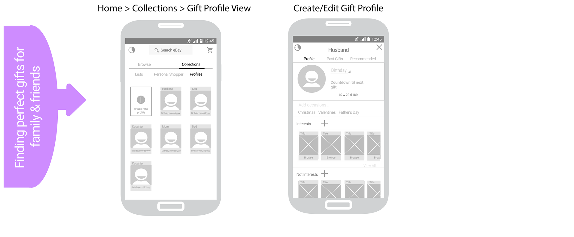
The above series of screens illustrates the key path scenario one might take to find the perfect gifts for a loved one. The user can add family and friends and specify their interests (and "not" interests) and set dates of holidays and birthdays, guaranteeing the best gifts will arrive in plenty of time before the special occasion. A history of all past gifted items is kept in which the user can rate gift satisfaction, improving future gift selection.

Searching is the first and foremost action most users take while shopping online. They want to find the best price, amongst other conditions such as distance, buying vs auction platform, and most recently listed. As such, typical searches are aided by efficiently accessed and usable refine and sorting patterns. I personally liked the previous eBay app's approach towards searches, thus a simple roll-back to a better UI is all that was needed.
Interact with the prototype below...